When it comes to painting your home, every rule is there to be broken! If you don’t know where to start though, these tips and tricks are very helpful.
1 Every designer is different, but I believe that if your home is painted in neutral colours, it’s much easier (and cheaper) to then add “pops” of colour through accessories eg cushion covers, wall art. This means that you don’t have to spend a fortune to have a colour scheme and that you can change the look easily if you get sick of it.
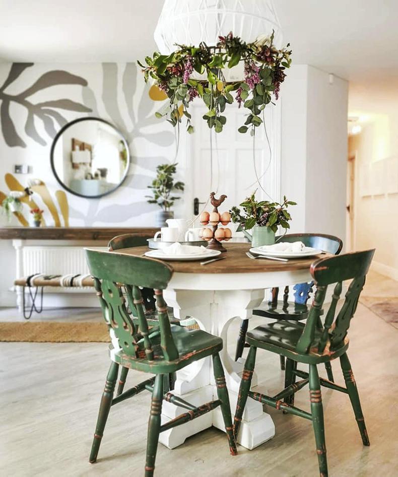
Pops of green work very well against neutral walls in Ireland. \ Wioleta Kelly
2 Consider where the light enters the room. If your room is north-facing, the light will be cold, so opt for warm colours on the wall and in accessories. A south-facing room, meanwhile, gets the most light, and any colour will work well, even darker shades. If it’s a west-facing room, remember it gets the most of its warm, orange light in the evening, so if you use this room later in the day, a cooler colour will work. On the other hand, an east-facing room will be cooler in the afternoon, so use warmer colours if you tend to spend your evenings here.
3 I am a big fan of Irish paint brand, Colourtrend, and one of my favourite neutrals is “Always Neutral” (code 0559). This is a really nice, bright colour, so it would suit any room, even north-facing. It has to be mixed though, so you will have to buy it in a shop. Other neutrals that I like include “Jitney” and “Drop Cloth” by Farrow & Ball, “Whale Bone” and “Solstice” by Colourtrend, “Palladio” by Crown and “Perfectly Neutral” and “New Wool” by Dulux.
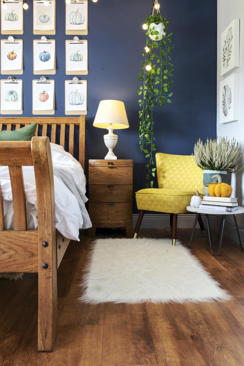
“Mussel” by Colourtrend is a navy that works very well in Irish homes. \ Lynda Kenny
4 For a “pop” of colour, I really like green, especially since we live in Ireland. It’s like bringing the outdoors in. Green can look great on a feature wall eg behind a bed, or on a sideboard or by painting up a few chairs. You don’t want an explosion of colour though; having it in one to three places in the room is enough to give a “wow factor”. One of my favourite greens right now is “Sweet Caper” by Colourtrend. It’s vibrant but subtle at the same time. Other options include “French Grey”, “Breakfast Room Green” and “Arsenic” by Farrow & Ball, “Puck” by Little Greene, “Dave’s Den” and “Frog Green” by Colourtrend and “Khaki Twist” by Crown.
5 If you want to experiment with other colours, I love “Bead” by Colourtrend for a pop of pastel pink, while “Mussel” by Colourtrend is a navy that works very well in Irish homes.
Wioleta Kelly runs Abbeyfeale Interior Design. Due to COVID-19 restrictions, she is currently offering online home and room consultations, and throughout the summer, will be running her five-day “Give your home a WOW factor” express course, sharing tips and tricks of the trade for just €49. For further information, visit
www.abbeyfealeinteriors.com or follow
on Instagram @wioleta_kelly and on
www.facebook.com/abbeyfealeinteriors
When it comes to painting your home, every rule is there to be broken! If you don’t know where to start though, these tips and tricks are very helpful.
1 Every designer is different, but I believe that if your home is painted in neutral colours, it’s much easier (and cheaper) to then add “pops” of colour through accessories eg cushion covers, wall art. This means that you don’t have to spend a fortune to have a colour scheme and that you can change the look easily if you get sick of it.
Pops of green work very well against neutral walls in Ireland. \ Wioleta Kelly
2 Consider where the light enters the room. If your room is north-facing, the light will be cold, so opt for warm colours on the wall and in accessories. A south-facing room, meanwhile, gets the most light, and any colour will work well, even darker shades. If it’s a west-facing room, remember it gets the most of its warm, orange light in the evening, so if you use this room later in the day, a cooler colour will work. On the other hand, an east-facing room will be cooler in the afternoon, so use warmer colours if you tend to spend your evenings here.
3 I am a big fan of Irish paint brand, Colourtrend, and one of my favourite neutrals is “Always Neutral” (code 0559). This is a really nice, bright colour, so it would suit any room, even north-facing. It has to be mixed though, so you will have to buy it in a shop. Other neutrals that I like include “Jitney” and “Drop Cloth” by Farrow & Ball, “Whale Bone” and “Solstice” by Colourtrend, “Palladio” by Crown and “Perfectly Neutral” and “New Wool” by Dulux.
“Mussel” by Colourtrend is a navy that works very well in Irish homes. \ Lynda Kenny
4 For a “pop” of colour, I really like green, especially since we live in Ireland. It’s like bringing the outdoors in. Green can look great on a feature wall eg behind a bed, or on a sideboard or by painting up a few chairs. You don’t want an explosion of colour though; having it in one to three places in the room is enough to give a “wow factor”. One of my favourite greens right now is “Sweet Caper” by Colourtrend. It’s vibrant but subtle at the same time. Other options include “French Grey”, “Breakfast Room Green” and “Arsenic” by Farrow & Ball, “Puck” by Little Greene, “Dave’s Den” and “Frog Green” by Colourtrend and “Khaki Twist” by Crown.
5 If you want to experiment with other colours, I love “Bead” by Colourtrend for a pop of pastel pink, while “Mussel” by Colourtrend is a navy that works very well in Irish homes.
Wioleta Kelly runs Abbeyfeale Interior Design. Due to COVID-19 restrictions, she is currently offering online home and room consultations, and throughout the summer, will be running her five-day “Give your home a WOW factor” express course, sharing tips and tricks of the trade for just €49. For further information, visit
www.abbeyfealeinteriors.com or follow
on Instagram @wioleta_kelly and on
www.facebook.com/abbeyfealeinteriors


SHARING OPTIONS